An Interview with Chad W. Beckerman
If cover designers are superhero alter-egos, then Chad W. Beckerman (art director and cover designer for Abrams Books for Young Readers and Amulet Books, as well as Mishaps and Adventures blogger) would have to be Clark Kent. Friendly and hard working by day, yet designing covers that have been known to burst onto shelves, leaping tall buildings (or at least generating lots of interest) in a single bound. Here are but a few:


ADVERTISEMENT
ADVERTISEMENT


Plus, take a look at his profile picture:

Somebody find this guy a phone booth.
Mr. Beckerman kindly sat down recently to discuss his work, the future of book covers, and his confusion over pirates with clean socks. Here are the results.
Scope Notes: How would you describe your job as a cover designer/art director?
Chad W. Beckerman: Very simple: it’s a dream job. I get to work with amazing artists, authors, and designers all in pursuit of making a book. I oversee the design, direction, and visual development of books for Abrams Books for Young Readers and Amulet Books, as well as overseeing the re-branding of the new ABRAMS logo and identity.

The editors and I think about which illustrators out there are doing work that excites us and who might have a good emotional response to the text.
Once an author and illustrator have been matched up, I will go over sketches with the illustrator and offer direction in the form of, advice, encouragement, advice, enthusiasm, and loads of jokes. I am also responsible for the design and direction of the books from cover to interior – and yes, even the back cover. I try my best to make the book look as entertaining as possible so it’s enticing for a reader to pick up.
How did you get into the business?
I graduated from the Rhode Island School of Design with a MFA in Illustration and hopes of working in some sort of job that would enable me to work with narrative subjects. After a summer of wandering the streets of New York looking for a job, an apartment, and a general direction in life, I found myself interviewing at Scholastic. But at that time I wasn’t looking for publishing work – I was showing around my illustration portfolio (http://cwdrawings.blogspot.com) again in hopes that I might illustrate a story. I had a small collection of black & white illustrations, mostly based on the works of Raymond Carver.


I also had a portfolio of book covers I had thrown together to show off my photo-illustration work. Next thing I know Elizabeth Parisi is offering me an assistant designer job. After a little over a year I moved on to Greenwillow Books where Paul Zakris hired me as Designer and was promoted then to Senior Designer. 1405 days later I left Greenwillow for an Associate Art Directors job at ABRAMS. 632 days after that I became the Art Director, give or take a day.
I was hoping for an hour-by-hour breakdown, but days is acceptable. I think I’m starting to get a sense of why you do the job you do – attention to detail.
Actually, I wish I were more detail oriented. I only know the exact days because I got addicted to timeanddate.com. It fascinates me to know specific numbers, like how many days I worked at one particular job or how many more days it is until the 4th of July, my favorite holiday.
I’m with you on the 4th. It’s gotta be the most under-appreciated holiday. I live in Michigan, so July 4th is about the only holiday where you don’t have to wear a jacket.
You like music, right? You know how musicians talk about the Beach Boys’ Pet Sounds as being hugely influential? Are there book covers that designers revere in a similar way? Are there covers that stand out to you as particularly inspiring?
I love music! In fact I listen to it while I work all the time. It helps me zero in and focus. You should really check out Marcellus Hall’s music. He is the illustrator of City I Love. Really amazing stuff.

Okay, back to the question. Here are a couple of books, artists, and designers that I find have influenced me and the way I think.
1. Molly Bang’s design for The Stinky Cheese Man.

Molly Bang’s design for The Stinky Cheese Man changed everything. Before this book, we hadn’t really seen how much design could do to enhance a picture book story. For good reasons, design stayed in the background. Here it was right out in front, helping to tell the story. In terms of design this book is still unmatched.
2. The N.C. Wyeth illustrated books from the early 1900’s.

The design evokes the mood of the story, but more importantly looks fresh and entertaining even after all these years.
3. The last few Chuck Palahniuk covers have been amazing.


4. Chip Kidd’s Book One is a great source of inspiration. If only to see the beginning of possibilities.

5. Lastly, even though this isn’t a book, the painting Christina’s World has always left a great impression on me. In fact the whole Wyeth family has. It’s worth a trip to Rockland, Maine to visit the Olson house which is depicted in this painting. It’s so beautiful there.

Have you seen the cover of The President’s Daughter? It’s an interpretation of Christina’s World.

Tim O’Brien’s illustrations are amazing. Talk about detail oriented!
Pardon me while I run with the Clark Kent analogy. Do you have cover kryptonite? Are there certain elements that you shy away from for personal or child-appeal reasons?
1. I have promised myself never to use a half cut off face, leg, arm or any other body part on a cover for the sake of not showing a specific person. It’s been done. Let’s move on.
Indeed.
2. Placing type on a cover that doesn’t harmonize with the cover art. The book and reader deserve a book that is thoughtfully designed and consistent.
I regularly read your blog Mishaps and Adventures. I especially love your “making-of” posts for books you’ve worked on. What was your goal in starting a blog?
Honestly, I started the blog in hopes of generating traffic to my website, which I launched about the same time. Oddly, the blog has turned into my site. It took me some time to figure out what I wanted to talk about and what I could talk about. It wasn’t until I did a post on the making of Something to Blog About, illustrated by Christine Norrie, that I figured out what I was doing.

I am a big process nerd and during those posts I enjoyed that I could give someone a look behind the scenes at the making of a book. I wanted to document how an idea comes to life and what other ideas might be left behind to make others grow. I feel like I am just beginning to hit my stride with Mishaps and Adventures. My hope is that the blog will turn into a teaching tool for people hoping to get into publishing, people in publishing, and even myself.
Do you have a philosophy when it comes to book covers? A credo? Limerick, perhaps?
A limerick or credo? The word that comes to mind is “iconic”. This is a lofty goal of course, but it’s a place to start. I try to design with this word in mind and a focused idea. I think the cover for Wimpy Kid is a prime example of a cover that is a very simple idea that works. The cover idea is based on this passage from the interior:
First of all, let me get something straight: This is a JOURNAL, not a diary. I know what it says on the cover, but when Mom went out to buy this thing I SPECIFICALLY told her to get one that didn’t say “diary” on it. Great, All I need is for some jerk to catch me carrying this book around and get the wrong idea.
I needed to make a cover that worked with this, yet remained very basic, so as not to clutter the cover with too much information. We could have gone with a cover that had a lot of cartoons to tell the reader that this was a graphic novel, but more is not necessarily better. So we chose to use one image that would sum up the entire book. And one bright color to catch the eye and identify this book with others in the series.

Another great example of iconic or simplified cover ideas are the Penguin cloth-bound classic series designed by Coralie Bickford-Smith.

These covers are a great example of using not only a perfect symbol for a book, but one that works for a series, and perhaps which takes a slightly new take on a familiar work. In this case, using simple patterns to describe the themes of the story. A fancy chandelier pattern for Great Expectations. A delicate blooming flower pattern for Sense and Sensibility.

Those do look nice. How do you feel about updating old covers? I recently read the article Tough Love, an open letter to kids book publishers by Diantha McBride in SLJ. One of her requests was for stale covers to get a redesign. I always think “man, if they could just do an update on this cover, the book would get the attention it deserves. What are your thoughts on this?
I think redesigning old covers is a great way to breathe new life into what might have become a stale idea. I love what they have done with the Penguin classics. It’s genius taking the drab idea of the classic and bring it into the modern world. For Example Candide, cover by Chris Ware; The Portable Dorothy Parker, cover by Seth; The Jungle, cover by Charles Burns; The New York Trilogy, cover by Art Spiegelman. Brilliant! I have often thought, “what would I come up with if I had to redesign a cover of my own design, only conceptualize it completely differently?” Would I do it any better? I think these kinds of questions are better left unanswered when dealing with your own work. Thankfully, I haven’t had to take this on as of yet.
Speaking of older covers, if you could have a crack at one cover from history, what would it be?
I would love to take on epic books such as War and Peace. Or an all-time favorite, Watership Down.
I say you just go for it, post it on Mishaps, and see what happens. Like M.S. Corley did with the Harry Potter covers. Have you seen those?

I have! They are amazing. However I think they are amazing now. I am not sure they would have worked in the American markets. But their simplicity is very refreshing.
So who has input on a cover design? Are kids ever consulted?
This can be slightly different from publisher to publisher but generally a cover will pass by the art director, an editor, publisher, and marketing director. All come to the table with certain objectives. An editor needs to make sure a cover is faithful to the book as well as the author. The publisher needs to make sure a cover fits in with the list and will sell. And the marketing director looks at a cover from the point of a consumer. How can we get them to pick up this book over another? Is the design right? Does it need a tag line? Perhaps a burst? The art director needs to foresee all these needs, hopefully before a final cover is routed. Before I get to a stage where I will bring a cover to a cover meeting I will work very closely with the editor to make sure our ideas sync. Very rarely will we consult kids. Perhaps if I had a room full of them this might work. But where can you find a room full of kids? Well, perhaps in a school room. But it’s frowned upon to walk into a class room and use them as a focus group. It’s better to take them out for a beverage an listen to what they have to say:

But in all seriousness, I lay it all down on the idea that if I don’t find it entertaining enough to pick up then neither will a kid.
It seems like you do a good job of putting yourself in the shoes of your audience.
I think it is a crucial part of my job. I hope that I succeed and stay current as long as I can.
How conscious are you of designing a cover that will have staying power (won’t get dated after a few years)? Is this a goal, or are you mostly looking for what will appeal right now?
I don’t think about the staying power of a jacket much. I can only think back to one cover that probably could have used some forward thinking. One of the first books I designed at ABRAMS was called Hell Phone by William Sleator.

ADVERTISEMENT
ADVERTISEMENT
Needless to say there is a cell phone on the cover. The image, I believe, was very arresting, but the phone itself became dated within a year. I guess if the book is a success the cover will stay, if it’s not then the cover will be reborn in paperback.
Or you could just rename the book Hell Phone: The Zack Morris Story.

See, these are the ideas that we are looking for! Hilarious.
Are there any trends you see on the horizon?
Currently, and for the last couple of years, the industry has been trying to figure out what to make of the graphic novel. I think Captain Underpants and Diary of a Wimpy Kid gave the industry an insight into how to make the genre profitable as far as middle-grade fiction goes. With any big success story you will find a lot of copycats in form and design. Usually, once an idea has been successful it’s very hard to copy that idea and make it a success as well.
However, there are some good things that come from these trends. Books are forced to evolve and better themselves by finding new ways of telling a story. For example, right now we are seeing an influx of novels with pictures and even comics to enhance the story. For a former reluctant reader, I think this is a great trend that will hopefully make reading more entertaining and act as a bridge to reading as a whole. I see this trend evolving even further into more interactive books, ones that enhance the entertainment-side of reading.
It does seem like things are heading that way. I think of The 39 Clues series and Skeleton Creek as recent examples of books that rate high on the interactivity scale.
Okay, free association time. Give me the first comment that pops into your head when you look at the following recent (and one not so recent) covers.

The Wild Things (fur covered edition) by Dave Eggers.
Jealously! Dave Eggers and the folks over at McSweeny’s are publishing some of the best designed books of the last 10 years.

The Lion & the Mouse by Jerry Pinkney.
Purrfection! I love this cover! I love that they had the courage (no pun intended) to not use any cover type. Amazing.

When You Reach Me by Rebecca Stead.
BIG RED DOT!
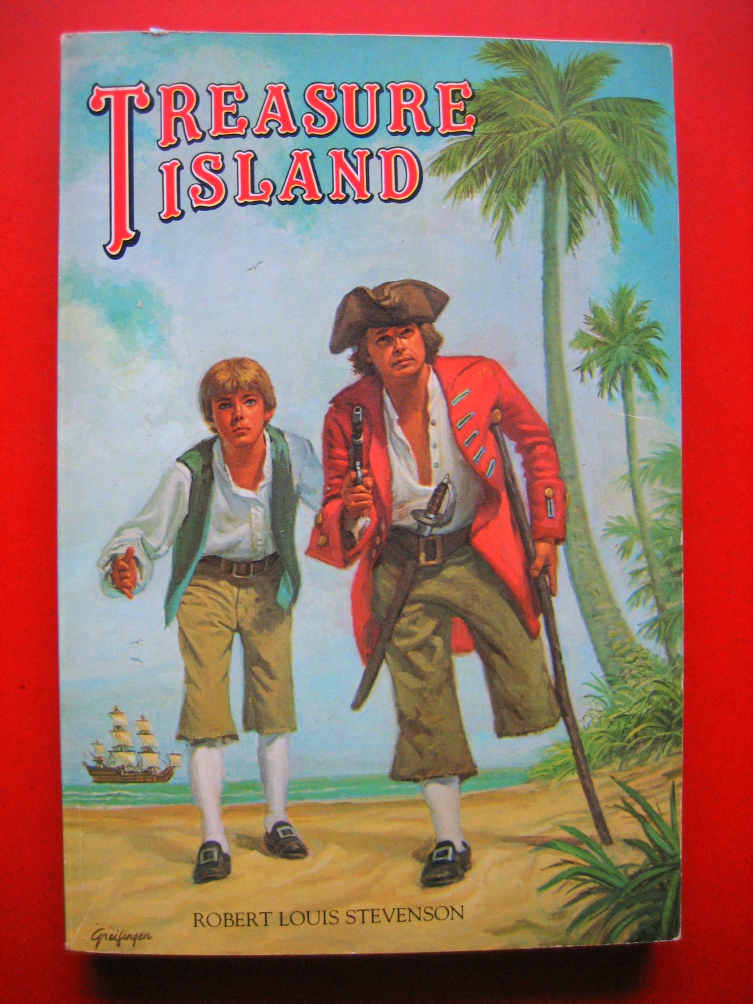
Treasure Island by Robert Louis Stevenson.
What the . . . ?
A couple things here (besides that no one, in my opinion, should do a Treasure Island cover besides N.C. Wyeth).
1. Why are the characters leaning forward? Do they have rickets from a long sea voyage?
2. How do they keep their socks so clean?
3. I think Robert Louis Stevenson deserves to have his name a little bigger. Just sayin’ . . .
4. Why does the boy look like the guy from C.H.I.P.S.?
Good question. My theory is that the guy from C.H.I.P.S. was the person who actually painted the cover. He included the piece in his resume and that’s what got him the C.H.I.P.S. gig.
Thanks for taking my question, Chad. Best of luck in all your future cover (and non cover-related) endeavors!


Covers Week continues tomorrow with a brand-new inductee into the Unfortunate Cover pasture of misfortune. Click here for a full schedule of events.
Join 2,000+ librarians! Subscribe to my newsletter on Substack
Filed under: Articles
About Travis Jonker
Travis Jonker is an elementary school librarian in Michigan. He writes reviews (and the occasional article or two) for School Library Journal and is a member of the 2014 Caldecott committee. You can email Travis at scopenotes@gmail.com, or follow him on Twitter: @100scopenotes.
ADVERTISEMENT
ADVERTISEMENT
SLJ Blog Network
Fuse 8 n’ Kate: The Wedding Procession of the Rag Doll & the Broom Handle and Who Was In It by Carl Sandburg, ill. Harriet Pincus
Bug Ego, vol. 1 | Review
Early May Update: Our list of possible Newbery contenders according to Heavy Medal readers
From Policy Ask to Public Voice: Five Layers of Writing to Advance School Library Policy
Fast Five Interview: Joy McCullough
ADVERTISEMENT
Love the free association at the end. I also love how these creative types look at the world.
Thanks for sharing this interview.
Absolutely delicious post! Plenty of insights, plus crucial looniness.
Great interview, I love Chad’s blog.
I’ve previously called Mr. Beckerman the Admiral Ackbar of cover design, but the Clark Kent analogy works, too.
Thanks for this interview and the many pictures you included with it. Very inspiring!
Love that Chad!
Travis, Thanks for a fun interview experience!—Chad
Thanks for taking part Chad – it was a pleasure.
Really wonderful article!
Totally fabulous.
I’m researching who exactly is behind the overt placement of esoteric, Freemason, and illuminati symbols in the 2008 children’s scholastic book “Library Mouse” by Daniel Kirk. The sybols are obvious. It’s all pretty “in-your-face”. On the cover: the mouses legs form a triangle with an eye in the middle (the cat’s eye). Furthermore there is an inverted cross in the mouses hand- not so much a “mouse” but an anthropomorphic transhuman creature. We turn the page to see the mouse pressing his finger against his lips (a favorite illuminati pose)… Inside the book: there are veiled themes of genetic manipulation (complete with a “super hippo” wearing an SS lightning bolt!). On one page we see a character screaming in mortal fear in front of an urban skyline; the title is “The Great Fall”. Since no image in the book is accidental, we must ask ourselves, “what are we looking at?” Throughout the book esoteric symbols abound. The messag of the book as well reeks of anti-Christian Globalist propaganda. In the Masonic tradition the reader is encouraged to value his own intellect above all else. The children want to meet the “author”, but when they look in the box there is only empty space. The theme appears to be that the author (“the creator”) does not exist- rather “we” are the authors of our own stories. The Freemasonic influence is undeniable, and the titles of the library books in the background seem to confirm this, revealing sinister hidden meaning: “The Fearsome Family”, “The Serpent’s Secret”, and “Danger Boy” (or “Danger, boy!” to the subliminal mind). I’m fascinated and wonder who is responsible for the placement of these symbols and the myriad subliminal messages throughout the book. I would love a reply. Thanks, Alan