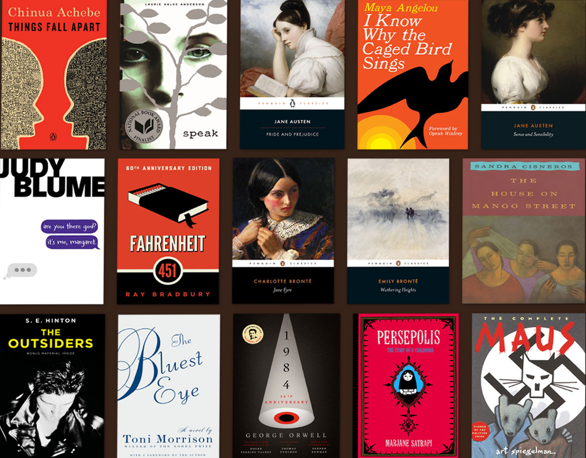
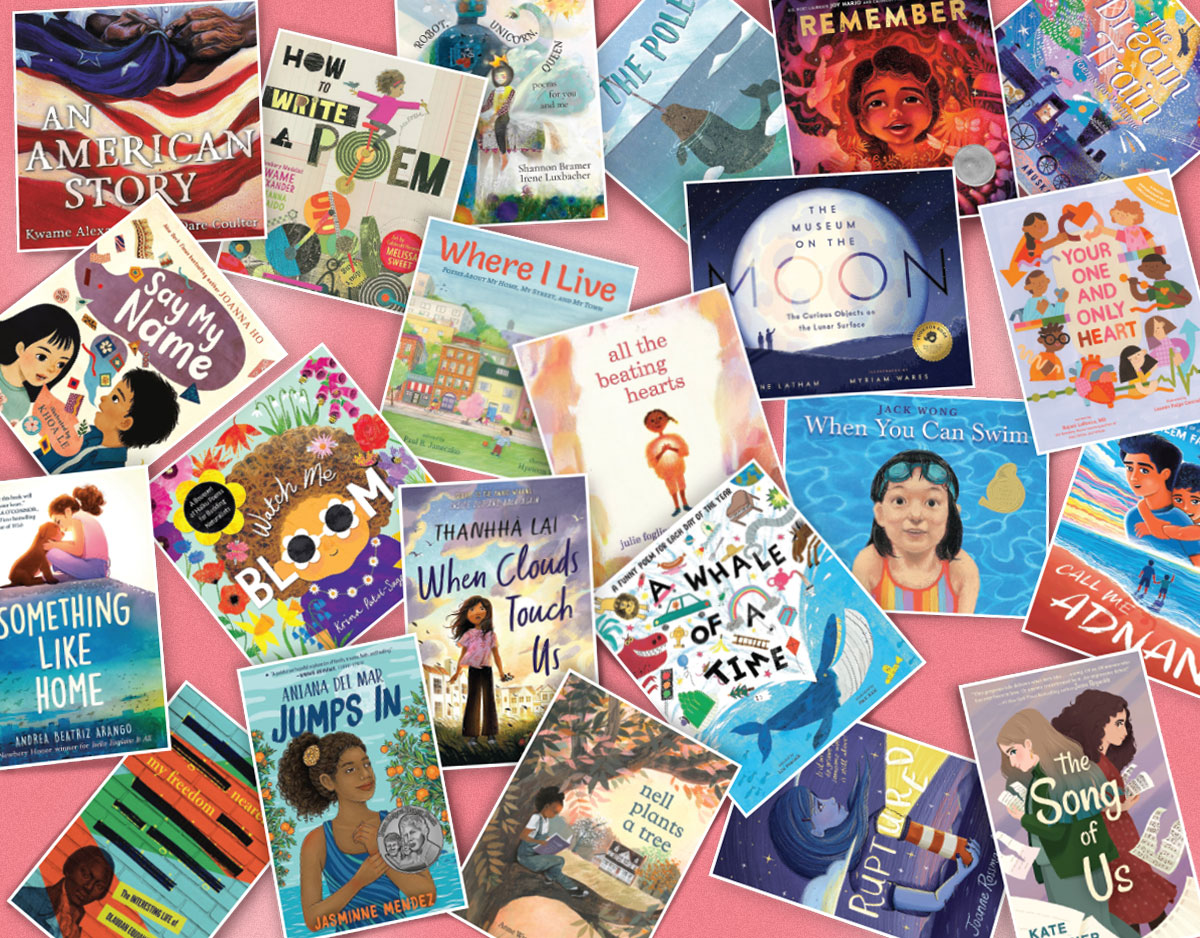
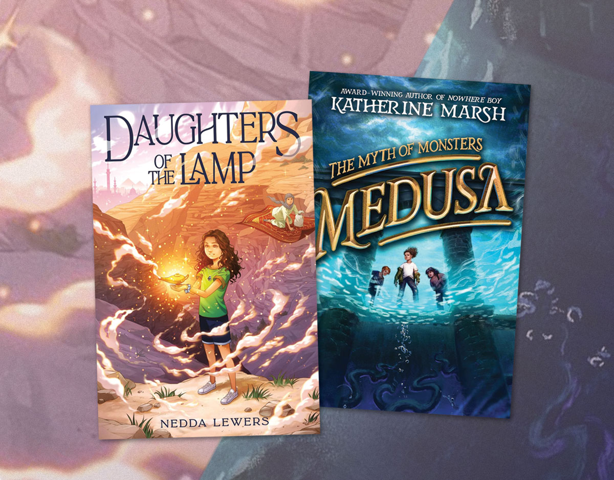
Four Decades of Children’s Book Covers
Each decade seems to have certain cover hallmarks that define the era. I’m no historian, but here’s how I would describe the last 40 years in children’s book jackets.
1970s
Illustrations were the standard, with some surprisingly subtle artwork to be found. Covers of the 70s weren’t afraid to be quiet. For the most part, color palates were muted and/or limited.
ADVERTISEMENT
ADVERTISEMENT
1980s
The 80s seem to be a time when realism was in. The Dell Yearling and Apple paperbacks were in full swing, each sporting realistic illustrations of the characters. Looking back, these got dated pretty quickly (see Unfortunate Covers #16, #12, and #1 ). Even hardcovers of the day were getting real. Book covers weren’t afraid to be, well, not perfect. Could you imagine a cover like Nightmare Mountain being released today?
1990s
After slowly transitioning out of the 80’s, things started to get noticeably more colorful and graphic. Cover type in particular seemed to get more interesting. Photos began popping up every now and then.
2000s
This decade (yes, crazy to think about it, but it’s over) will likely be known for the rise of the photograph. Photoshop allowed for more creativity in using preexisting images rather than illustrations. Cropping also became wildly popular. Overall, covers saw a narrowing of focus. Busyness was out, bold images were in. The distinction between middle grade and YA also seemed to get more pronounced, with black backgrounds becoming a popular YA choice. Textures, effects, and materials came into play more than they ever have before.
2010s
?
We shall see. Early returns show a continuation of many trends from the aughts. Could this be the decade that covers lose some of their importance, as we move more toward digital realms? I doubt it – you’ll need to look at something on your virtual book holder thing (or whatever we decide to call it), right? Will illustrations make a resurgence? How about more mingling between photos and artwork?
What are your thoughts on the future of book covers? Any predictions out there (paging Chad W. Beckerman and Maria T. Middleton)?
Filed under: Articles
About Travis Jonker
Travis Jonker is an elementary school librarian in Michigan. He writes reviews (and the occasional article or two) for School Library Journal and is a member of the 2014 Caldecott committee. You can email Travis at scopenotes@gmail.com, or follow him on Twitter: @100scopenotes.
ADVERTISEMENT
ADVERTISEMENT
SLJ Blog Network
Monster Befrienders and a Slew of Horror/Comedy: It’s a Blood City Rollers Q&A with V.P. Anderson & Tatiana Hill
Monkey King and the World of Myths: The Monster and the Maze | Review
Parsing Religion in Public Schools
ADVERTISEMENT


Those quiet illustrations can be pretty iconic. For instance, the overall design of TUCK EVERLASTING is quite memorable (I think Natalie Babbitt actually painted the little scene, but the bright yellow and the hollow font help to pull the package together). Memorable is what counts, in my opinion, which is not necessarily the same as splashy.
I think the current trend of YA covers — glossy photos of headless bodies wearing layered gowns, for instance — will look just as dated as those goofy Reebok covers from the 80s!
Personally, as a YA author, I want more illustrated covers in YA; more intrigue and less…literalness. The cover should imply a story, and not be a Vogue fashion shoot!
I think I’m with you on the headless covers getting dated in a hurry, but I don’t think anything can age as fast as the Apple and Yearling covers. They were so specific with clothing and trends of the day.
Great post! Did you know that Lois Lowry took the photograph of the man that is used in the cover art of The Giver?
I didn’t know that. It’s a great photo.